N O W L O A D I N G . . .
標準がキモいと思うのはワタクシだけ?その2
こんにちは
先週日曜日は仕事。
日曜日はボイラーが非稼働。
よって、室温8度。
マジ死ねる。
さて、今回は。
またまた開発ネタ。
開発というよりも、お遊び。
標準でキモいボタンをなんとかすべく、コントロールテンプレートを作成したが、前回は昼休憩が終了したため時間切れ。
本日はそれをカスタムコントロール化した。
これでライブラリとして他の開発からでも利用可能。
こんなボタン一つ誰が使うねんwww
まずは完成の図
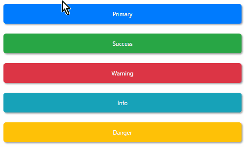
ボタンの動作はマテリアルデザインを参考に。
ボタンのカラーはBootstrap4を参考に。
命名「BootMaterialButton」
キモさ軽減できたwwwww
今回は、前回のものに加えて角の丸め具合を追加。
カスタムコントロールXAML
カスタムコントロールにするにあたり、プロパティのバインドを追加している。
ControlTemplate
<Grid Margin="5">
    <Border
        Name="Border"
        Panel.ZIndex="0"
        Background="{TemplateBinding DefaultBackgroundColor}"
        BorderBrush="{TemplateBinding DefaultBorderColor}"
        BorderThickness="{TemplateBinding BorderThickness}"
        CornerRadius="{TemplateBinding CornerRadius}">
        <Border.Effect>
            <DropShadowEffect
                x:Name="Shadow"
                BlurRadius="5"
                Direction="315"
                Opacity="0.5"
                ShadowDepth="3"
                Color="Gray" />
        </Border.Effect>
    </Border>
    <Border
        Name="BorderWhite"
        Panel.ZIndex="1"
        Background="White"
        BorderBrush="Transparent"
        BorderThickness="0"
        CornerRadius="{TemplateBinding CornerRadius}"
        Opacity="0" />
    <Border
        Name="BorderContent"
        Panel.ZIndex="2"
        Background="Transparent"
        BorderBrush="Transparent"
        BorderThickness="0"
        CornerRadius="{TemplateBinding CornerRadius}"
        FocusManager.FocusedElement="{Binding ElementName=contentPresenter}">
        <ContentPresenter Name="contentPresenter" />
    </Border>
</Grid>

<ControlTemplate.Triggers>
    <Trigger Property="IsFocused" Value="True">
        <Setter TargetName="Border" Property="Background" Value="{Binding RelativeSource={RelativeSource TemplatedParent}, Path=FocusedBackgroundColor}" />
    </Trigger>
    <Trigger Property="IsEnabled" Value="False">
        <Setter TargetName="Border" Property="Background" Value="{Binding RelativeSource={RelativeSource TemplatedParent}, Path=DisabledBackgroundColor}" />
    </Trigger>
    <Trigger Property="IsEnabled" Value="False">
        <Setter TargetName="Border" Property="Background" Value="{Binding RelativeSource={RelativeSource TemplatedParent}, Path=DisabledBackgroundColor}" />
    </Trigger>

    <Trigger Property="IsMouseOver" Value="True">
        <Trigger.EnterActions>
            <BeginStoryboard>
                <Storyboard>
                    <DoubleAnimation
                        Storyboard.TargetName="BorderWhite"
                        Storyboard.TargetProperty="Opacity"
                        To="0.3"
                        Duration="0:0:0.3" />
                    <DoubleAnimation
                        Storyboard.TargetName="Shadow"
                        Storyboard.TargetProperty="Opacity"
                        To="0.8"
                        Duration="0:0:0.3" />
                </Storyboard>
            </BeginStoryboard>
        </Trigger.EnterActions>
        <Trigger.ExitActions>
            <BeginStoryboard>
                <Storyboard>
                    <DoubleAnimation
                        Storyboard.TargetName="BorderWhite"
                        Storyboard.TargetProperty="Opacity"
                        To="0"
                        Duration="0:0:0.3" />

                    <DoubleAnimation
                        Storyboard.TargetName="Shadow"
                        Storyboard.TargetProperty="Opacity"
                        To="0.5"
                        Duration="0:0:0.3" />
                </Storyboard>
            </BeginStoryboard>
        </Trigger.ExitActions>
    </Trigger>
</ControlTemplate.Triggers>
カスタムコントロールクラス
サクッとVBで以下のプロパティを作成。
・DefaultBackgroundColor
・DefaultBorderColor
・FocusedBackgroundColor
・DisabledBackgroundColor
・CornerRadius
ビルドすればDLLとして作成される。
作成したカスタムコントロールを使う
・プロジェクトの参照設定に作成したDLLを追加

・コントロールを使用するXAMLの参照を追加
xmlns:controls="clr-namespace:OriginalControl;assembly=OriginalControl"・リソースにスタイル定義を追加
<!--  Primary  -->
<Style x:Key="OriginalButtonStylePrimary" TargetType="controls:OriginalButton">
    <Setter Property="DefaultBackgroundColor" Value="#007bff" />
    <Setter Property="Foreground" Value="White" />
    <Setter Property="CornerRadius" Value="5" />
</Style>

<!--  Success  -->
<Style x:Key="OriginalButtonStyleSuccess" TargetType="controls:OriginalButton">
    <Setter Property="DefaultBackgroundColor" Value="#28a745" />
    <Setter Property="Foreground" Value="White" />
    <Setter Property="CornerRadius" Value="5" />
</Style>

<!--  Danger  -->
<Style x:Key="OriginalButtonStyleDanger" TargetType="controls:OriginalButton">
    <Setter Property="DefaultBackgroundColor" Value="#ffc107" />
    <Setter Property="Foreground" Value="White" />
    <Setter Property="CornerRadius" Value="5" />
</Style>

<!--  Warning  -->
<Style x:Key="OriginalButtonStyleWarning" TargetType="controls:OriginalButton">
    <Setter Property="DefaultBackgroundColor" Value="#dc3545" />
    <Setter Property="Foreground" Value="White" />
    <Setter Property="CornerRadius" Value="5" />
</Style>

<!--  Info  -->
<Style x:Key="OriginalButtonStyleInfo" TargetType="controls:OriginalButton">
    <Setter Property="DefaultBackgroundColor" Value="#17a2b8" />
    <Setter Property="Foreground" Value="White" />
    <Setter Property="CornerRadius" Value="5" />
</Style>
・ボタンを配置
<controls:OriginalButton
    Height="50"
    Margin="5"
    Style="{StaticResource OriginalButtonStylePrimary}">
    <TextBlock
        HorizontalAlignment="Center"
        VerticalAlignment="Center"
        Text="Primary" />
</controls:OriginalButton>

<controls:OriginalButton
    Height="50"
    Margin="5"
    Style="{StaticResource OriginalButtonStyleSuccess}">
    <TextBlock
        HorizontalAlignment="Center"
        VerticalAlignment="Center"
        Text="Success" />
</controls:OriginalButton>

<controls:OriginalButton
    Height="50"
    Margin="5"
    Style="{StaticResource OriginalButtonStyleWarning}">
    <TextBlock
        HorizontalAlignment="Center"
        VerticalAlignment="Center"
        Text="Warning" />
</controls:OriginalButton>

<controls:OriginalButton
    Height="50"
    Margin="5"
    Style="{StaticResource OriginalButtonStyleInfo}">
    <TextBlock
        HorizontalAlignment="Center"
        VerticalAlignment="Center"
        Text="Info" />
</controls:OriginalButton>

<controls:OriginalButton
    Height="50"
    Margin="5"
    Style="{StaticResource OriginalButtonStyleDanger}">
    <TextBlock
        HorizontalAlignment="Center"
        VerticalAlignment="Center"
        Text="Danger" />
</controls:OriginalButton>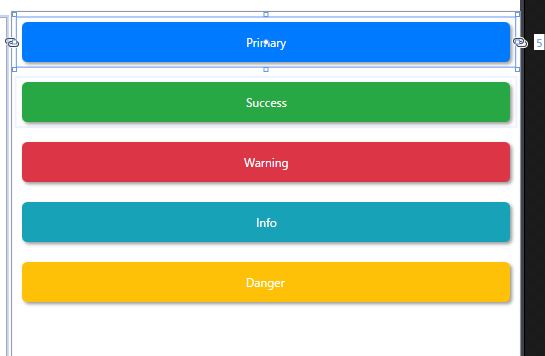
こんなふうに配置される。
ま、こんな感じか。
カラー定義はプロパティにすればいいかと思ったが、あまりガチガチにしてしまうと後で応用できず困るので却下。
スタイルとして定義することにした。スタイル定義はシステムに合わせて共通リソースファイルを作ると楽だろう。
今回は、ボタンに動作を付けていないので「Command」プロパティは空っぽ。
せっかく作るのに、なんだかさみしいね。